Some of my favorite typographic film titles
If you are a follower of Stunning Proof, you know that my teaching and ideas about design and storytelling have been inspired in great part by film and title sequences. For the next couple of weeks, I want to feature some of my favorite typographic-based film titles. While putting together a presentation for my Message and Content class, I started to realize how applicable these typographic sequences are to unexpected projects like book design. In my advanced Type 4 class, students are pushing the boundaries of book design. Display type plays a crucial role in establishing an initial reading of the text. We also spend time talking about pacing and sequencing. Often we try to create a filmic flow through the text of the book. Instead of type in motion over time, as we see in film, in book design pacing is calculated by how quickly or slowly a reader turns the page. In addition to learning about type and motion, these typographic film sequences have much to teach us about activating the book space.
Dr. Strangelove or: How I Learned to Stop Worrying and Love the Bomb (1964); Hand-Lettering

I love the quirky, hand-lettered typographic system designed by Pablo Ferro for Stanley Kubrick’s 1964 film Dr. Strangelove.
Ferro’s loose letterforms and slack compositions superimposed over aircraft footage represented a distinct departure from American title design of the time. Prior to 1966, the aesthetic of main titles was defined primarily by designers Binder, Brownjohn, and Frankfurt and their symbolic geometry, clean typography, and bold graphic forms. The stage was set for Ferro’s strain of ambitious artistry. His lettering, variously squat, long, and lean, allows the footage to peek through, unobtrusive but utterly individual. It was all done by hand, with grease pencil on glass…
Recalls Ferro: “I tried to do the lettering like it’s usually done in films, but [Kubrick] said, “Pablo, I don’t know whether to look at the lettering or look at the plane. We have to see both at the same time.” I said to myself, oh boy, how could you do that? I remembered that I do my own lettering, just doodling around, thin and tall and things like that, and I thought I’d try that, said Ferro.
We did a test and it worked! Stanley filled the screen with my lettering. It was perfect! You could see the plane and you could see the lettering at the same time. (Pablo Ferro Interview Pablo Ferro: A Career Retrospective written by Lola Landekic on Art of the Title.)

“The challenge was that I had to do everything, all the layout, and then when I had just done the last layout, [Kubrick] asked me: “Where’s your name?” I didn’t know I was supposed to put my name! The only open space was between two parts so I did it there, very little. You have to look for it. From then on, it was amazing working with him. I never thought that lettering I did was anything special — the only person there that liked it was Stanley,” said Ferro.
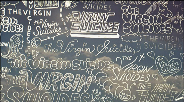
The Virgin Suicides (1999): Hand-Lettering


The bubbly, girly type that I remember doodling all over my notebooks perfectly grounds the film title sequence for The Virgin Suicides (1999). The sequence sets up this 1970’s period movie about five suburban sisters who commit suicide and the neighborhood suburban boys who observe and narrate the story through their memories. The film marked Sophia Coppola’s debut as a film director.
In the boys’ fevered imaginations, Lux and her sisters appear in golden meadows, or superimposed on rolling cloudscapes like the silent heroines of a mid-70’s soft drink or shampoo commercial. (Not for nothing does Lux share her name with a brand of dishwashing detergent.) And the film’s soundtrack, along with the hypnotic sounds of Air, features sounds of the 70’s too lavishly gruesome even for classic rock radio. But rather than mine the banalities of popular culture to flaunt her own coy postmodern sophistication, Ms. Coppola infuses these songs and images with authentic feeling. Bands like Styx and Electric Light Orchestra, widely ridiculed in later times, once spoke the language of the heart’s desire. More than most recent movies about suburban adolescence, ”The Virgin Suicides” catches both the triviality and the grandeur of youth, its prosaic details and its mythopoetic flights. (A. O. Scott, The New York Times, 2000)
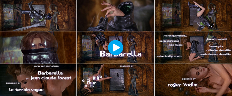
Blow-Up (1966) and Barbarella (1968): The Swinging Sixties Type and Image

In the swinging 6o’s Michelangelo Antonioni film Blow-Up, images of models and photographers show through the tall, bold-condensed type of the title sequence. The images show through the type which sits on the green field of a London park that figures prominently in the story. Instead of moving image filling the screen. The moving images live inside the title type, creating a hypnotic, kaleidoscopic feel that is perfect for the late 60’s storyline.

In Barbarella (1968), the curvy type moves sinuously around the screen as star Jane Fonda slowly strips from her spacesuit: the perfect swinging 60s striptease echoing the form of the female figure.
By the mid to late 1960s tricksy title sequences in a range of graphic styles had become ubiquitous in films with fashionable pretensions, for example Blow Up (1966) which opens with cut-out type through which audiences can glimpse cat-walk models, or Barbarella (1967) in which the titles flutter around the film’s undressing protagonist. These were probably the kinds of sequences that Saul Bass would have dismissed as ‘pizazzy’, but, as he did not deny, they were part of a trend that he had played an important role in establishing. (Emily King on Typotheque)
Links to the title sequences in this post:
http://www.artofthetitle.com/title/dr-strangelove-or-how-i-learned-to-stop-worrying/
http://www.artofthetitle.com/title/the-virgin-suicides/
http://www.tcm.com/mediaroom/video/294743/Blow-Up-Movie-Clip-Open-Mimes.html
http://www.artofthetitle.com/title/barbarella/
Continued next week.